A daily public log of what I am working on. Kept short, kept honest.
A quieter few days. Telescope case study got its final round of polish — copy, layout, a bit of breathing room between sections. Nothing dramatic, just the kind of work where you keep opening the page, squinting at it, and moving one thing two pixels to the left.
Also finally updated this log properly. It's been sitting with three entries for weeks and that felt wrong. The journal should at least match the pace of the work, even if it's a week behind.
Four entries now. Feels more real.
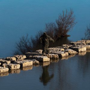
Went to Sheffield for the SafeWalk field research. Walked the routes I'd modelled in the prototype — the ones the safety score flagged as moderate or unsafe — and photographed them. Underpasses, broken streetlights, the stretches where there's nothing between you and the dark.
It's one thing to build a tool that weights crime data and lighting density. It's another to stand in the spot you were assigning a number to. The score felt more real after that.
Got the photos onto the case study page with a lightbox gallery and a YouTube embed of the prototype walkthrough. The page needed evidence, not just explanation. It has it now.
Deep in the SafeWalk case study this week. The project card was done but the page it linked to was empty — so that became the focus.
Built the case study structure: problem framing, the research behind the safety score, the route colour system, the Chrome extension PoC. Reworked the card thumbnail twice before it felt right. The first version was too clean. The second added the score panel — 72 / MODERATE in yellow — and that was the one. Yellow over green, always. Green looks like any other map app. Yellow means the tool is actually doing something.
Also started pulling the Telescope case study together on the side. Two things in parallel is fine as long as you know which one is the main thing.
Spent most of the week getting the foundations right. Liquid glass nav, the work experience table, this journal, the Spotify player — all of that came together in the first few days. Then the Telescope case study, which took longer than expected mostly because of the logo.
I tried recreating the Telescope mark in code. Went through three versions — flat-top hexagon in a diagonal staircase, then the 2-column Z arrangement from the brand PDF, then pulled it out entirely. That last call took longer than it should have. There's something uncomfortable about cutting the thing you spent time on. But the case study is about the brand work, not the logo in isolation. Cleaner without it.
Good week overall. The site feels like something now rather than a scaffolded skeleton.
Slow start today. Needed a few cups of tea before anything made sense.
Spent the day on the Telescope case study — specifically trying to get the logo right in the slide deck. Telescope has a distinctive mark that I worked on during my time at the company. Recreating it in code meant going through a few attempts: started with a flat-top hexagon in a diagonal staircase pattern, then realised that wasn't matching the brand PDF, corrected it to the 2-column Z arrangement, then made the call to just pull the logo out entirely.
That last decision took longer to make than it should have. There's something uncomfortable about removing the thing you spent a lot of time on, even when you can see it's introducing noise. The case study is about the brand work, not the logo in isolation. Cleaner without it.
The page sits properly now.
Sunny one today. Took a walk in the afternoon which helped clear the head before sitting down to build.
The day was about getting SafeWalk onto the portfolio properly. SafeWalk is a walk-safety overlay I designed — it colour-codes your route based on crime data, streetlight density, and a weighted safety score, sitting on top of the map you're already using. Built the whole thing as a Chrome extension PoC for Sheffield.
Today I built the project card for it. Wanted the thumbnail to tell the story without any copy doing the work — a map, three routes (safe, moderate, unsafe), streetlamps at intersections, a score panel. All hand-drawn in SVG. If you glance at it for two seconds you should know what the product does.
The score panel shows 72 / MODERATE in yellow rather than a green Safe score. Deliberate. A green score would just look like any other navigation app. Yellow makes it look like the tool is actually evaluating something, which is the point.
Got it integrated into the projects grid and it sits cleanly alongside the other cards. The /safewalk page it links to doesn't exist yet — that's next.
Slightly cold weather today. Rained all night and now it's cozy sleeping weather. I got an interview lined up for next week which I am looking forward to for sure. Spent the day building out a bunch of features on the portfolio. The big one was adding a liquid glass effect to the nav bar. It uses a WebGL shader to refract whatever is sitting behind it as you scroll, giving it a frosted glass feel. Getting it to behave cleanly took some work because the library strips styles after it initialises and breaks pointer events on links. All sorted now and it looks good.
Added a work experience section underneath the projects too because it made sense for the user to see all of this immediately on the website itself. Before, the interaction was to go to my CV and then see all of this. Pretty tedious, if you ask me. Did not make much sense. Clean three column layout showing the start year, company name, and role.
While I was touching on the header, I also had the idea of adding a link to this very page with the purple dot. I wanted to maintain a digital journal for a while and this is nothing more than that. Also, added a music player for the song i listened to today the most, not all days will have a repeating song but i will share it on here to sum up the vibe of the day.
Also set up this daily log today. Two systems running in parallel: Notion for the public facing version, Obsidian for the full honest account. Writing this from the end of day, which feels like the right way to start. :)